One More Try
Published on 2020-10-13 in Turbot Keyboard.
This project has been a bit unlucky from the beginning. Not only it is a continuation of a failed project, which brought its own problems, but I’ve been really sloppy with the execution as well. I decided to get mu stuff together a little bit more and give this layout a fair chance this time. So I’m going to make this keyboard, at a proper scale and with known good switches. It will be 2mm higher because of that, but it will be comfortable.
This keyboard is driven by three main goals:
a reasonably complete keyboard with digits and arrows that is low- profile,
with an ergonomic, one-piece split layout,
ortholinear.
This project was most inspired with something called the TGR Alice keyboard, designed by Yuk Tsi:
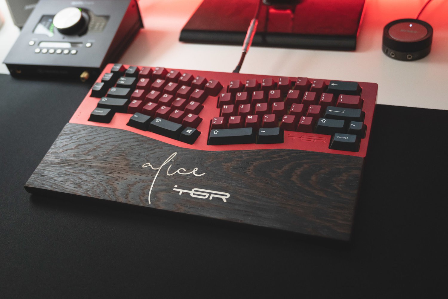
There is simply something very elegant in the way he compromised between the available keycaps, the traditional layout, and the needs of ergonomy. I love how this looks, however, I learned that layouts with staggered rows like this make it harder for me to touch-type. I want an ortholinear layout, where the keys are arranged in a grid, or at least into columns for each of the fingers. The original Turbot layout was an attempt to create something like that, mostly based on the Atreus layout and some other ergonomic keyboards, trying to make the gaps between keys manageable by angling each column at a different angle. But if you look carefully at that Alice keyboard, that is not what they did there. Instead, you have three sections of the keyboard, each angled differently, but otherwise following the traditional layout.
So what if I took an ortholinear keyboard instead, but then repeated the operations they did with Alice on that? I came up with something like this:
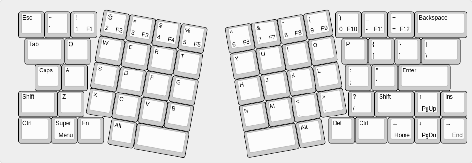
It’s a little busier than Alice, mostly because there are more keys on the bottom row, and because the grids of the ortholinear parts are very strong visual cues, so it is not as elegant, but it should be equally or even more convenient. This time I didn’t stagger the columns—except for the ones for the little fingers, which are naturally about half a key lower, due to the angling. That should work well with the fact that the little finger is shorter in most people.
I also removed some of the extra keys Turbot originally had on the sides—since I need a “function” key anyways for Fn keys, I can as well put them on a separate layer, together with all the media keys and such. Thanks to that the PCB also has a much more “normal” shape:
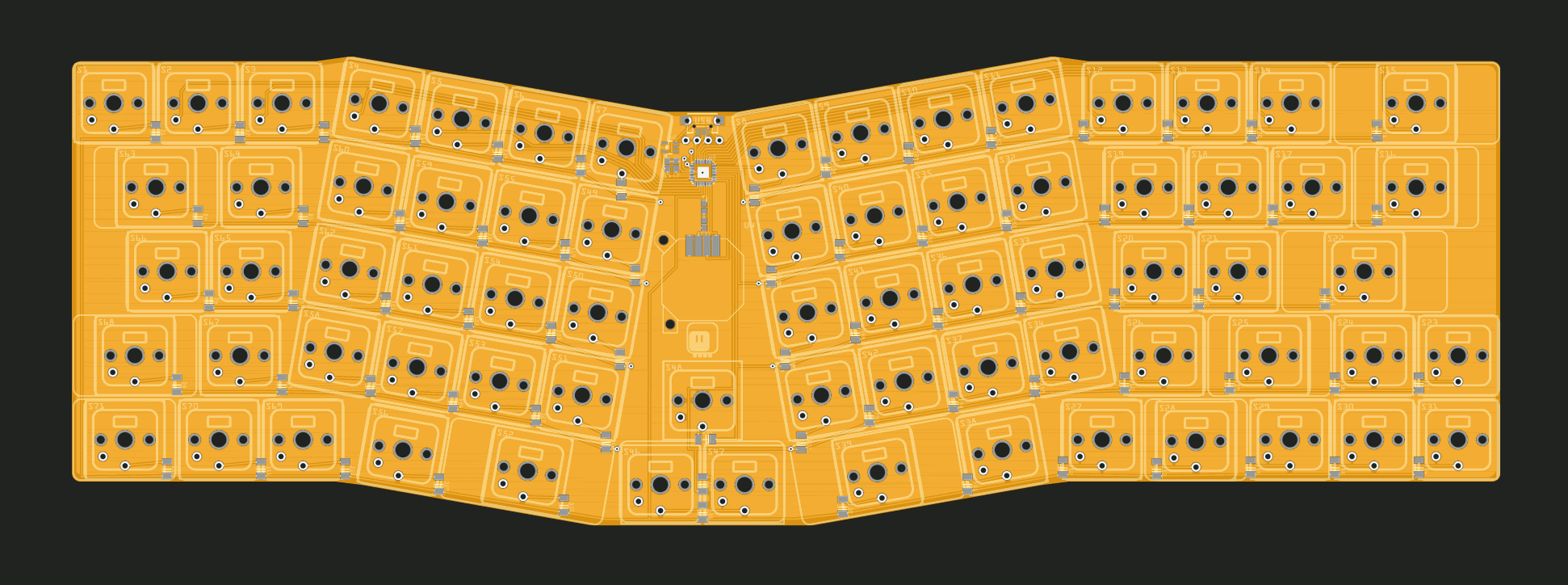
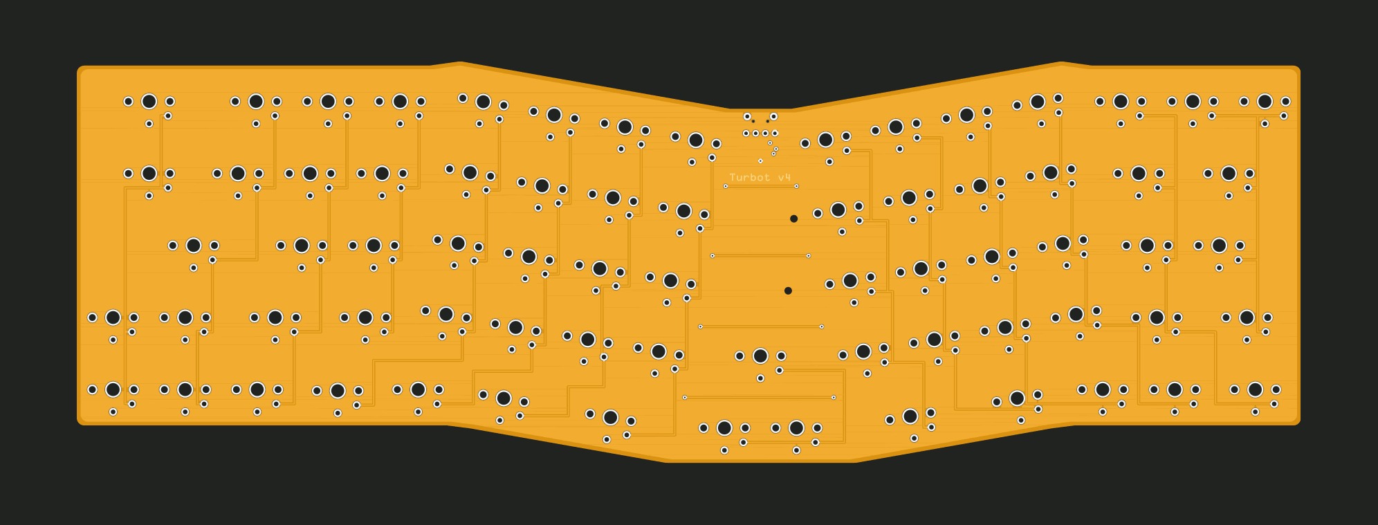
You can tell that I didn’t really take my time to route the traces nicely and make them all bend at 45° angle, as they should. The reason is that with the modern fabrication methods it doesn’t really matter, and I was in a hurry to add this PCB to an already ongoing order at JLCPCB, so that they can be shipped together. You see, they let you do that, and since there was a National day, my order didn’t ship yet, so I used the chance.
I have now made a version of that PCB with nicer traces and with some holes for mounting stabilizers, I will make it available if this PCB works.
I still had some free pins, so I added a single LED and a joystick, with some extra keys in the middle — maybe I will make it emulate mouse too, we will see. In the worst case I will leave those unpopulated.
Note about key caps: I am going to use the same key caps I initially got for Flounder, and they are a bit of a strange set. This layout is designed specially for those key caps. All keys are either 1U, 1.5U or 2U, except for the Ctrl keys, which for some reason are 1.25U. More common key caps usually have more of the .25U keys, since the two bottom alphanumeric rows are staggered by 0.25U, but not on the keyboard those key caps were made for. I have no idea why they did that. The short version is, that if you plan to use any key caps from a normal keyboard, you will have to modify this design somewhat.
Then, since I’m waiting for the PCB anyways, I also took some time one evening to think about the precise location of the keys on the other layer. I came up with something like this:
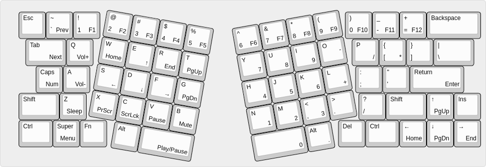
I might still move the arrow cluster on the left hand side, to make it a more standard WASD, but I’m not sure.
 deshipu.art