Undoing 150 Years of Bad Design
Published on 2020-09-20 in Dorsch 48k Keyboard.
Computer keyboards are sub-optimal. Everybody knows that. You can find hundreds of articles extolling the virtues of alternate layouts that tell the story of how first typewriters had their keys in an alphabetic order, but they would jam, so they have been rearranged to slow the typist down and avoid jamming. Those stories are mostly made up, and virtually all research that shows substantial improvements from using layouts like Dvorak is done by the proponents of those layouts themselves. People get so focused on that debate, that they ignore other problems computer keyboards have.
Typewriters were complex, precise mechanical devices, very expensive to make. That means that if there was a change to the design that made it slightly less comfortable or required getting used to, but made the machine easier to build, it was embraced. Today there is no reason to keep following all those design decisions, but they have become tradition.
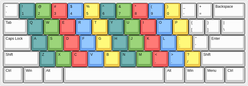
Take the staggering of the keys. If you look at a traditional keyboard, you will note that the Q key is shifted by ¼ horizontally from A, and that A is similarly shifted by ½ from Z. The reason for this is not human convenience, it’s because the keys were originally mounted on metal stems, and there needed to be room for the stems to go all the way up to the rest of the mechanism. This doesn’t seem to matter much, until you start to learn proper touch-typing and they tell you that your fingers should follow the “columns” of keys. What columns, you ask, they are all jumbled up! Well, the columns that would be there if they weren’t jumbled up:

Also note how your right pinky finger – the smallest and weakest finger you have – is supposed to handle 13 keys, just because the whole layout is skewed that way.
I have struggled with this for years, because it simply doesn’t make any sense — it’s easier to press the B key with right hand, and to press the Y key with left, for example. Don’t even mention using the correct finger.
Or another thing, the relative sizes of the keys. Originally typing machines were powered by the muscles of the typist. And you needed to use quite some force to get it to work properly. But the most force was needed on the special keys that did something else than just swing a tiny little hammer — the space bar, which moved the whole mechanism forward, the enter key (or rather, lever), which scrolled the sheet of paper, the shifts that moved the whole assembly up or down, and the backspace. And if you look at the keyboard, those are the largest keys. It’s because it was easier to press them with force when they were bigger, but on a computer keyboard, where each key has the same tiny switch underneath it makes no sense, maybe with the small exception of the space bar, which needs to accommodate or famous opposable thumbs.
Then there is the issue of the number of keys. Some typewriters had separate keys for lower and for upper case letters — Linotype is one famous machine that retained this design. Others introduced the “shift”, which moved the whole mechanism a little, so that the second set of symbols could be used. But there was still quite a lot of keys needed, so traditional layouts have five rows of keys. On any touch- typing lessons they tell you that your hands should rest on the so called “home row” — where the F and J keys are, and only reach up or down from there, without moving your wrist. But this is impossible for most people with average finger length — to reach the number row you already have to stretch, and reaching the functions keys or the Esc key is practically impossible without moving your hands. There are too many rows of keys! (And also all those keys to the right of the keyboard, there is now way you can reach them with your poor pinky.) Today we don’t need all those rows, we can have as many modifier keys for switching layers as we want. In fact, we already have those Ctrl and Alt and Super keys that we hardly ever use.
And then we have thumbs. I suspect the original designers of typewriters must have had them severely atrophied, because the only thing you were supposed to do with your strongest fingers was to press the space bar. Which at first wasn’t even a key. All the other modifier keys that are doing heavy lifting moving the whole mechanism around are supposed to be pressed with your pinky fingers. Thumbs are severely underused.
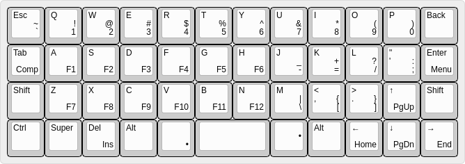
I could keep going, but you probably already see where I’m going with this. Most of those design decisions are unnecessary at best, and harmful at worst today. Let’s get rid of them, and use mechanical design that makes sense with modern technology. That means straight columns, regularly sized keys, fewer rows, more modifier keys, and keys operated with thumbs. That pretty much means Planck layout, or something similar to that.

This is the layout I am currently using with my Dorsch 48k. It’s loosely based on Planck, but with some small tweaks to make it more similar to traditional keyboards (T-shaped arrow key block, Enter in the correct position, two Shifts). Most importantly, this layout makes it much easier to touch-type — in fact, you do it intuitively, because there is simply no room to move your hands anywhere.
 deshipu.art